 To say “responsive design” is a hot topic right now is an understatement. As proof, just google it, and you’ll find great resources and articles about it online. In addition, as it relates to this specific meetup (agenda listed on that page) – I was one of 60+ people that were on a waiting list for this CBS Local venue that holds 120 and I was lucky to get in.
The WPNYC community definitely wanted to hear what the speakers had to say. Sonja Liex (link to slides below), and Jack Reichert (link to slides below) were game and I thought they gave a great overview of the issues developers face with the explosive growth of web-enabled devices. This post hopefully compliments and extends what was covered by the speakers Tuesday night. Slides and video will be available so I’m just rounding out my own thoughts here.
Down The Rabbit Hole Of History
The speakers chose a topic that is very timely because as more and more end users choose to digest content from a diverse collection of devices, developers are asking themselves how can they keep up?… and still have their content look great. After all, content is king and if you don’t serve your users in a manner they expect, you’ll get left behind. One by one content publishers are taking a look at their vistor stats and making changes, Actual Insights Blog relates their experience with “responsive WordPress” and shares a great recommended reading list. I won’t go down the rabbit hole of history of this topic too much, mainly because Jared Ponchot of Lulabot (of Drupal fame) does a great job of doing that here.
Wait, This Sounds Familiar
 Responsive design has evolved into a broad concept in product development, and it’s larger than WordPress.
‘Our understanding of “responsive design” should be broadened to cover any approach that delivers elegant visual experiences regardless of the size of the user’s display and the limitations or capabilities of the device.’ – Jeffrey Zeldman.
He also has another popular quote in this post that takes me back in time- ‘It’s what some of us were going for with “liquid” web design back in the 1990s, only it doesn’t suck.’
This meetup also reminded me of my experience connecting with Filipe Fortes at a Technology “Watercooler” Talk at Time Inc. last year (then of Treesaver, now of Flipboard.) I tried to get him introduced to the higher-ups at one of my previous employers but they were content to stay with Zinio. If his name sounds familiar, it should. He was part of the crew that worked on the awesome, yet killed Microsoft Courier. Recently, some of his associates made noise releasing or being associated with the release of some interesting iPad apps.
Challenging Conversation
 To prepare my mind for the meetup, I did some related research on the Interwebs and I saw that .Net magazine did a feature on “Responsive WordPress” and then ran across this interesting related dustup between Josh Clark and Jacob Nielson (the comments sections on both positions are a priceless read.) Also this post addresses some of Nielson’s comebacks.
Mostly, the Web industry is treating Nielson like the guy at the party that forgot his pants. Web professionals found Nielson’s comments about publishers needing multiple site versions curious because he skipped over the entire responsive design movement. I mention this because it may be relevant if you have some challenges dealing with clients and stake holders in your business dealings and discussion of responsive design. This stuff also plays off of some of the arguments in Jack Reichert’s presentation as I would find out Tuesday evening.
Why Are We Even Catering To These Devices?
There are a diverse range of opinions out there… take this comment by Justin Tadlock I found recently “Honestly, I’m still questioning the entire responsiveness movement. I like what can be done, but it’s steering Web design in the wrong direction. What I mean by this is that the device should know what to do with standards-based code. The code shouldn’t be catering to the device. That’s kind of backwards. Those are my thoughts. Responsive designs are definitely on my radar.”
This was something that came up in group discussion at the meetup. Some of us have clients that would rather have the end users cater to their “fixed” way of presenting content and be done with it. The counter to this is obvious ofcourse- how much are you willing to risk alienating any part of your audience due to a crappy user experience? Bringing the focus back to reality and starting to talk hard numbers– relating to who can effectively see your content and who can’t, should steer the conversation to where it needs to go.
Content.Users.Content.Users.
 The presentation wasn’t necessarily WordPress specific much to the chagrin of some of the attendees but that was sort of the point. When you start to break down the genesis of “Responsive Design” it’s about content strategy as it is about design or technical implementation. (If you want to talk implementation scroll down to the stuff about themes.)
There seems to be two situations a developer will face, trying to upgrade a current site or accounting for responsive design at a site’s inception. Either way, in both situations there is homework to do and two philosophies are at the center of this homework. Graceful degration vs. progressive enhancement.
Graceful degradation is loosely described as cutting things away from a core “desktop” site depending on the end user device.
Progressive enhancement is the opposite, where content publishers focus on the “base” of their content (acceptable to all devices) and add content to extend their offering based on capabilities of the end user device that can handle the enhanced experience.
At it’s core, this is a conversation about how to best serve your content and understanding how to get it to your audience with minimum preconceived assumptions about how your users absorb it, allowing for some flexibility. After doing your due diligence you come with a game plan that divides your investment in your content into “vital” presentation items and what is “optional” per device. Here’s a great post on simplebits that illustrates my meaning.
Broad Strokes
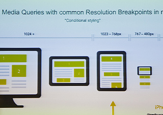
Sonja covered formulas and techniques with the flexible fluid grid + CSS3 media queries to address styling issues per targeted device. Her explanation of all the ratio-based relationships between element and container was helpful. She discusses the “target / context = results” forumla and it cascades down the dom tree to get the desired responsive effect. Please reference her slides to get my meaning.
 Jack got into stuff like “Graceful degradation” vs. “Progressive enhancement” and “crafting experiences that honor your content and your user.” His Camel vs. Stallion analogy about typical “design by committee” situations hit home for me. His main point was to find whats really important in the content (see the “Mobile First” philosophy) and that implementing a responsive approach does add a level of complexity to your building process but not compared with maintaining multiple versions of a site.
Principles of Responsive Design
Jack also presented what he called the “Principles of Responsive Design,” I’m paraphrasing here… please reference his slides when they are available.
1. Keep content king- respect your content, respect your users
2. Think mobile
3. Be progressive in your approach
4. Be semantic in your code
5. Labeling your dom elements is Key: Ids, classifications, microformats, ARIA
6. “C” is for cascade, hacks, know your selectors
7. Hide advanced CSS from older browsers
8. All javascript must be unobtrusive
9. Update your scripts, and gain features from the new code
10. Optimize your assets, minify, gzip
The Mechanics
When you pull back the curtain on the mechanics of a responsive design, it’s simple in theory- ideally, some kind of server-side technology (like PHP or Ruby) receives the request for data, server-side scripting “feature sensing” or “user-agent sniffing” of the client is initiated, the server decides what modules to load, re-position (or hide depending on your logic.)
There are lots of pros and cons, so there is an emphasis on early scope. Don’t over promise because your presentation won’t look perfect on every device, the idea is to have some kind of representation or version on most devices and to be practical.
Take Your Time
Start small, every content publisher’s solution should be tailored to their content and site architecture. Narrow your focus to core of content, essentials, build from there. It’s not practical to have a desktop site and use display:none to hide things as the base responsive solution. The example was given that you don’t want to download a data heavy media player to a mobile device, only to hide it because it’s not being used. Strategies must be put in place that take care with download time versus is a user missing important content.
There was also talk of client backlash rejecting responsive sites such as (old school) magazine-minded people that have a print mindset that desire their layout to be unchanging, pixel locked and the challenges involved.
Book Learnin’
 A few books were mentioned by the presenters and during the back and forth with the audience, looks like good reading:
1. Mobile First by Luke Wroblewski
2. Responsive Web Design by Ethan Marcotte
3. Adaptive Web Design by Aaron Gustafson
4. Hardboiled Web Design by Andy Clarke (Someone mentioned this book during the Q&A)
Resources & Links, Stuff From Q&A
1. Apple Voiceover
2. Responsinator.com
3. Prefixr.com
4. CSS3Please.com
5. DetectMobileBrowsers.mobi
6. DIV Layer Editor Creator was in the house and gave his plugin a shoutout, check it out.
7. Mobile Detector Plugin
8. JQuery Mobile
Plugins were mentioned as a possible way to introduce responsive features to a current theme. A quick search of the WordPress.org plugin repository seems to back this up. Here are three examples:
1. Respond.js
2. Responsive 2010
3. WP Fluid Images
Using WordPress body class to show or hide content, customize presentation in one theme, across multiple sites or views, etc. was discussed. There is a lot online about this technique.
Issue of dealing with the Apple high resolution Retina display and images was posed, this post on css-tricks.com makes some suggestions.
Someone in the crowd mentioned Nicole Sullivan’s Object Oriented CSS in a question.
Examples Of Responsive Sites
CSS-tricks.com, Studiopress.com, Smashingmagazine.com were all cited as examples as good responsive designed sites.
Somebody Mention Theming?
 Before I get into themes, since this is as much about content strategy as it is about design- I want to sneak in this link to an interesting post about Implementing Taxonomy for Better User Experiences and this recent one I found of Mobile Interface design principles.
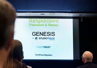
During the presentation there was a lot of talk about Studiopress’ Genesis and DIYThemes’ Thesis ( because of timeliness of updates and available support) but here are some responsive theme resources I found after doing some cursory searching:
1. Responsive Web Design for WordPress Theme Designers
2. What’s Your Favourite WordPress Responsive Theme Framework?
3. How to Choose the Right Responsive CSS Framework
4. 15 Responsive CSS Frameworks Worth Considering
5. Brave the Seas of HTML5 WordPress Development with Bones
6. 40 Best Responsive WordPress Themes
7. 65 Stylish and Lightweight Responsive WordPress Themes
8. 10 HTML5-Ready Blank, Bare-Bones and Naked Themes for WordPress
9. Responsive Web Design with HTML5 and the Less Framework 3
10. Origin: Responsive parent theme for Hybrid
Sonja’s Presentation Slides & Notes
 Sonja was nice enough to post her assets online here: Sonja’s Slides, and Sonja’s notes.
Jack’s Presentation Slides & Notes
View Jack’s slides (best viewed in Safari- use the keyboard arrows, and spacebar to advance.) Read Jack’s notes.
Don’t Email Steve :-)
I’m recapping Steve’s introduction to the group here… His main point was don’t email him :-) We have 1900+ members, and our meetup is run through here: WordPressNYC. We meet every third Tuesday of the month. We will not meet in June (because of Wordcamp NYC 2012, see below for more information.) Our community is run though this Website here: WPNYC.org. Separate sites, separate logins – don’t confuse them. WPNYC.org has a pretty robust jobs board and helpful forums. Don’t email Steve :-)
WordCamp NYC 2012
 Did I mention don’t email Steve? Go here: Wordcamp New York City http://2012.nyc.wordcamp.org/ … 800 slots for newbies to pros, on June 9-10 @ Baruch college. Tickets go onsale in May, sign up for the email newsletter (below the countdown timer on the right of the Wordcamp page) to get your notice. Oh, he’s taking submissions for presenters and sponsors, so you guys can email him :-)
The Wrapup
This meetup was a collision of a lot of worlds for me. Many of the issues discussed I have backburnered or I was dealing with only in theory and this presentation brought them into the forefront. Personally, I have been trying to come up with my own “bootstrap” (my own personal base Web app starter suite.) So far, with my recent experiences with Ruby, Compass, Blueprint, and SASS/SCSS- I am really interested in working with LESS and messing with Twitter Bootstrap, or Foundation. But, now after looking at this again because of this meetup and revisiting my research, I’m releaved to know I have a lot of options if I want to leverage what I already know about WordPress into my future prototyping with a “responsive” theme. This Bones theme might be what I am after. Stay tuned.
Rumor Has It
The next meetup with be all about WordPress multisite (WordPress MU) Stay tuned for that…
Hope To See You At A Meetup
Want to bump into me at a meetup? Check out my profile on meetup.com
Please Comment, Share Your Experiences
Feel free to add corrections, links and updates to this post in the comments if I missed anything. I especially want to hear what your takeaways were from the meetup or dealing with the issues involved. Thanks for visiting.

 Each day HTML5 and CSS3 show up on my radar more and more, like some kind of incessant reality show that dominates the topic of conversation at the office water cooler. But in this case, HTML5 and CSS3 dominate Internet chatter and the trends I follow on Twitter, where HTML5/CSS3-related issues have really been picking up steam. As I alluded to
  As of today HTML5 is no longer like a mythical white Unicorn, or just a new and cool buzzword uber-geeks throw around on Internet blogs. It’s something more real and tangible, thanks to
  I’ve primarily used “Arial” and “Verdana” as my html text fonts. Recently, I’ve been re-visiting that as a rule. There’s been a number of Windows and Mac OS updates in the “wild” for a while now, so perhaps my options have expanded and I thought it’s a good a time as any to freshen up my work.